Steady
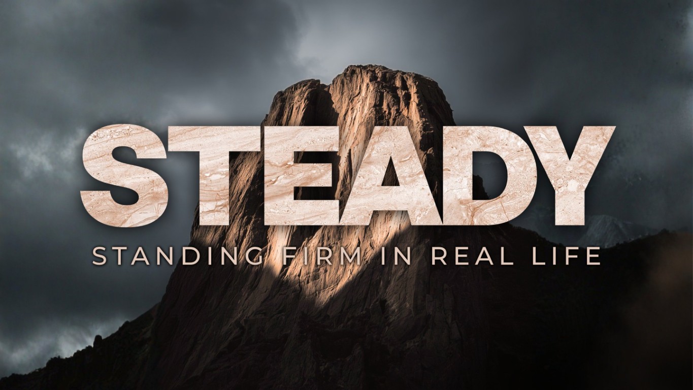
A four-week series on standing firm through ordinary difficulty. The artwork had to carry weight without turning grim, work as a YouTube thumbnail and a projected title from the same idea, and give the church a background it could reuse every week.
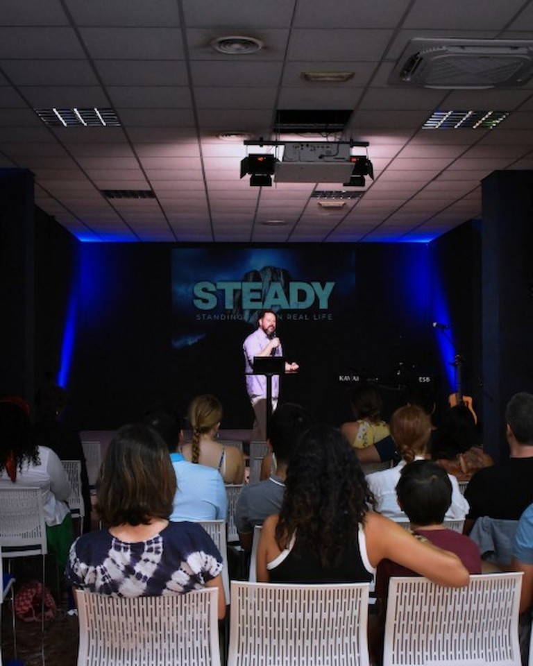
The room projects onto a black wall rather than a screen, which keeps the stage clean but costs a lot of brightness. Anything designed for it has to hold up when the blacks crush and the mid-tones go flat, while still looking great on TVs, monitors, and phone screens.
The idea
One lit peak against a storm, and the word STEADY cut from stone. The texture inside the letterforms is the argument: steadiness is not the absence of weather, it is what the rock is made of.
What we made
- Title treatment with a stone texture filling the letterforms, aligned so the grain runs horizontally and reads as strata rather than noise
- Subtitle in a tracked sans, sized to sit under the title without pulling focus
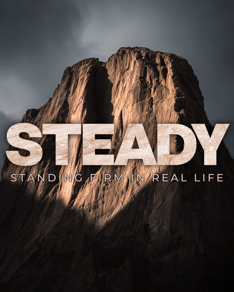
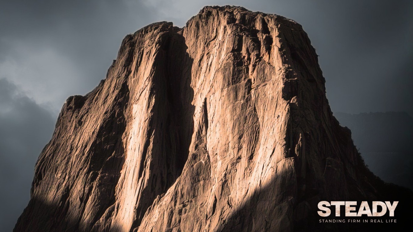
- Seven outputs: 16:9 for projection, 1:1 and 4:5 for feed, 1920x692 banner, a stream thumbnail, a Bible verse slide, and a clean plate with no type
- Each ratio composed individually, with the type moved relative to the peak so the texture never fights the lit rock behind it
- Thirty-second bumper cut in DaVinci Resolve
Designing for multiple uses, not just one
A church publishes the same series to a projector, a feed, a stream and a banner, and each one crops differently. Composing once and cropping four times is how titles end up half off the edge. Every ratio here was laid out on its own.
The insight worth naming
Make the title out of the thing the title is about. Setting the word in stone is a smaller idea than a metaphor and a stronger one, because the viewer understands it before they have finished reading.