The Jesus Centered Life
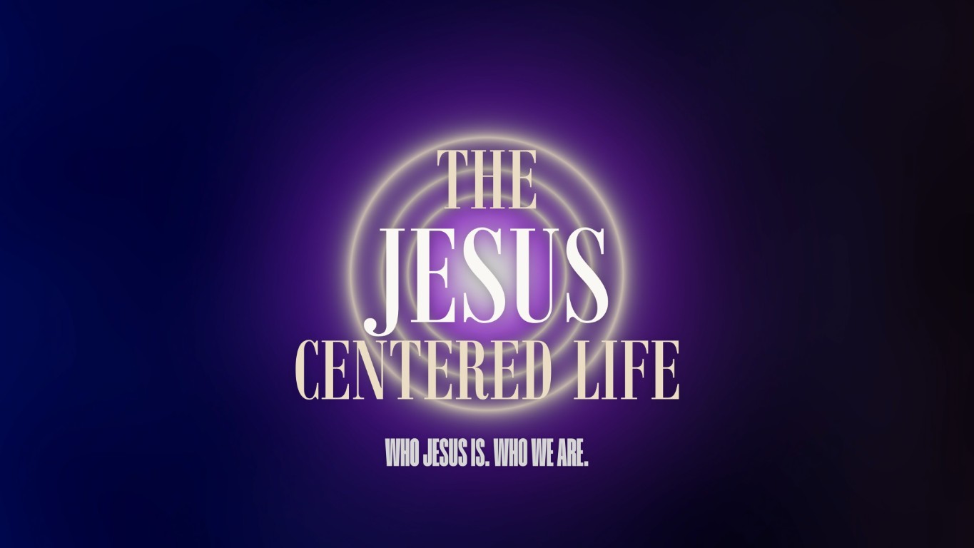
A five-week series on who Jesus is and who that makes us. It needed a full visual package for the platform, the television and social, ready before the first Sunday, and it needed to hold up across every ratio the church publishes in.
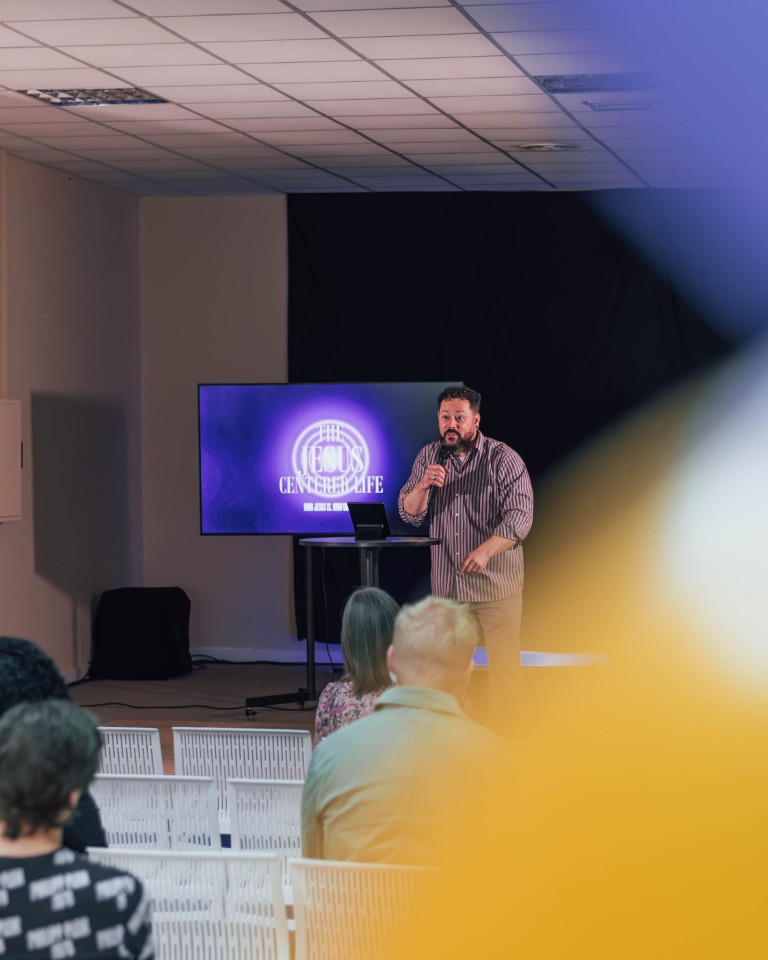
The series launched in the middle of a move into a new space. No projector yet, so the artwork had to work on a television rather than a screen, in a room that was still unfinished and unpainted. The design had to be the one thing in the building that looked ready.
The idea
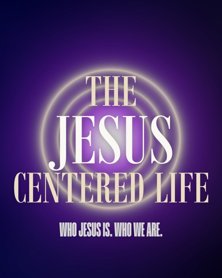
The series is about a life with Jesus at the center, so the artwork is built as concentric rings of light radiating from a single point. The word JESUS sits at that point, set brighter than everything around it. The design makes the argument before anyone reads the subtitle.
What we made
- Title treatment in a condensed serif, with a three-level hierarchy carried by brightness rather than size, so JESUS reads first at any distance
- Subtitle in a condensed sans, wide-tracked, to anchor the composition without competing with the title
- Title art in 16:9, 1:1 and ultra-wide, each composed for its frame rather than cropped from one master
- A clean plate carrying the rings and the light but no type, for scripture and lyric slides
- 30-second bumper cut in DaVinci Resolve
The plate matters as much as the title
Every series kit ships a version of the artwork with the type removed. It is the file a church actually uses most — every lyric, every verse, every announcement sits on it — and it is the file most series packs forget to include.

The insight worth naming
The strongest series art argues the sermon's point rather than decorating it. If the design can be explained in one sentence that is also the sermon in one sentence, it will hold together across every ratio and every week.