House Style
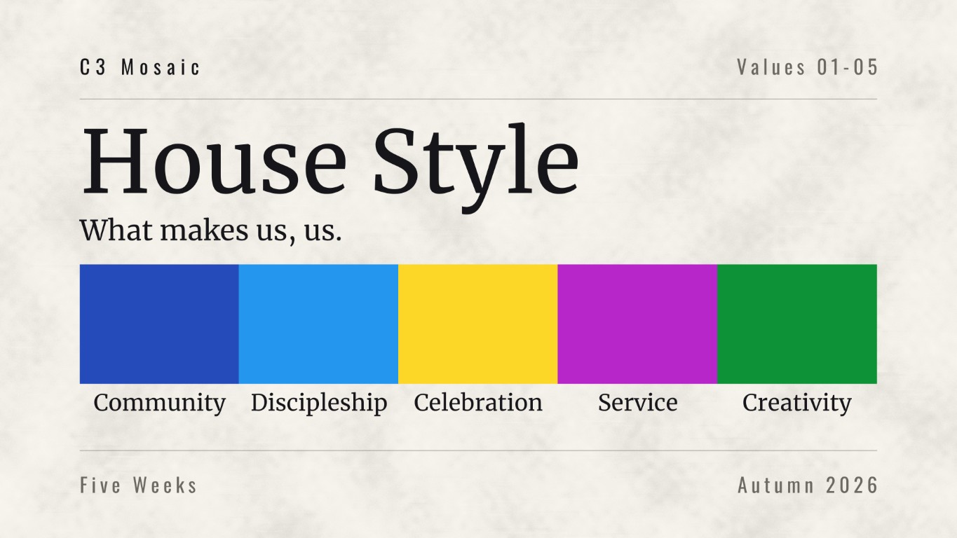
A five-week series on the church's five core values: community, discipleship, celebration, service and creativity. One value a week, each needing its own identity while the five together had to read as a single system.
A five-week series has to stay interesting to the same congregation on week four. Anything built around a single image runs out by then, so this needed a structure that could change every week without changing what it looked like.
The idea
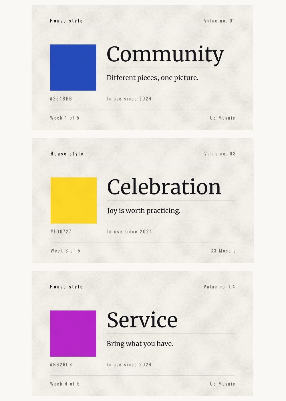
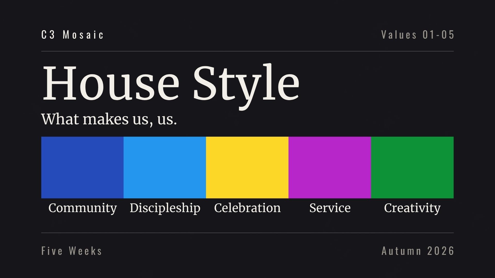
The series is about what makes a church recognizably itself, so the artwork was built as pages from a brand style guide. Corner labels, hairline rules, a swatch with its hex code printed underneath, a value number, a week counter. The form makes the argument before anyone reads a word: these are our specifications, and this is what we look like.
What we made
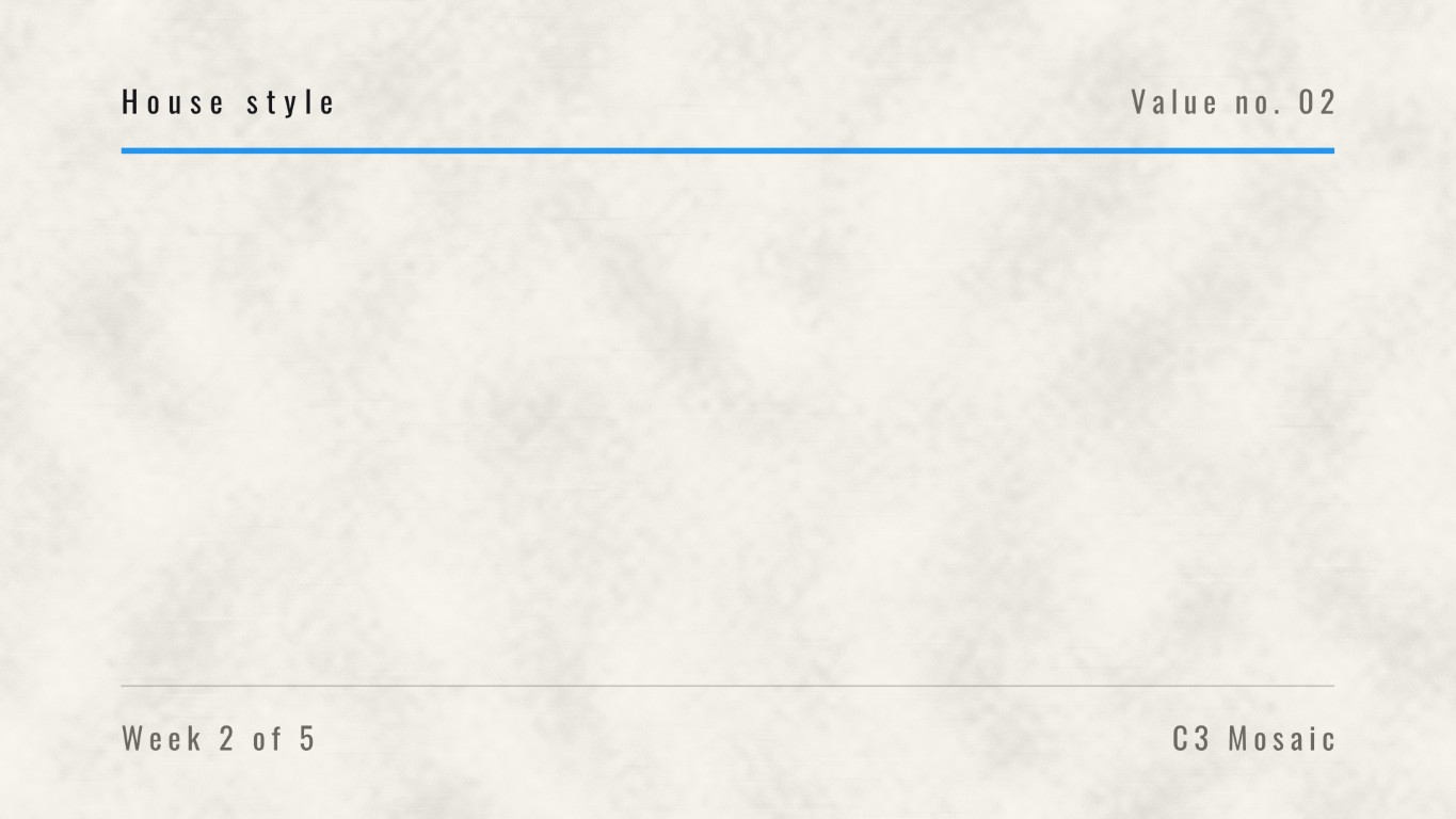
- A template carrying the full set of guide furniture — running head, value number, week counter, church name — so every week sits in the same frame
- Five weekly titles, each with its own swatch, hex code and one-line definition
- An opening graphic that lays all five swatches side by side and functions as a contents page for the series
- Blank plates for each week, carrying the week’s color rule into sermon slides
- Every ratio the church publishes in, plus a 35-second bumper
Why a system rather than an image
A five-week series built on one photograph is the same slide five times. Building it as a guide meant each week could be genuinely new — a different color, a different value, a different line — while the layout, the rules and the labels stayed fixed. The structure does the recognizing so the content is free to change.
Two surfaces, one system
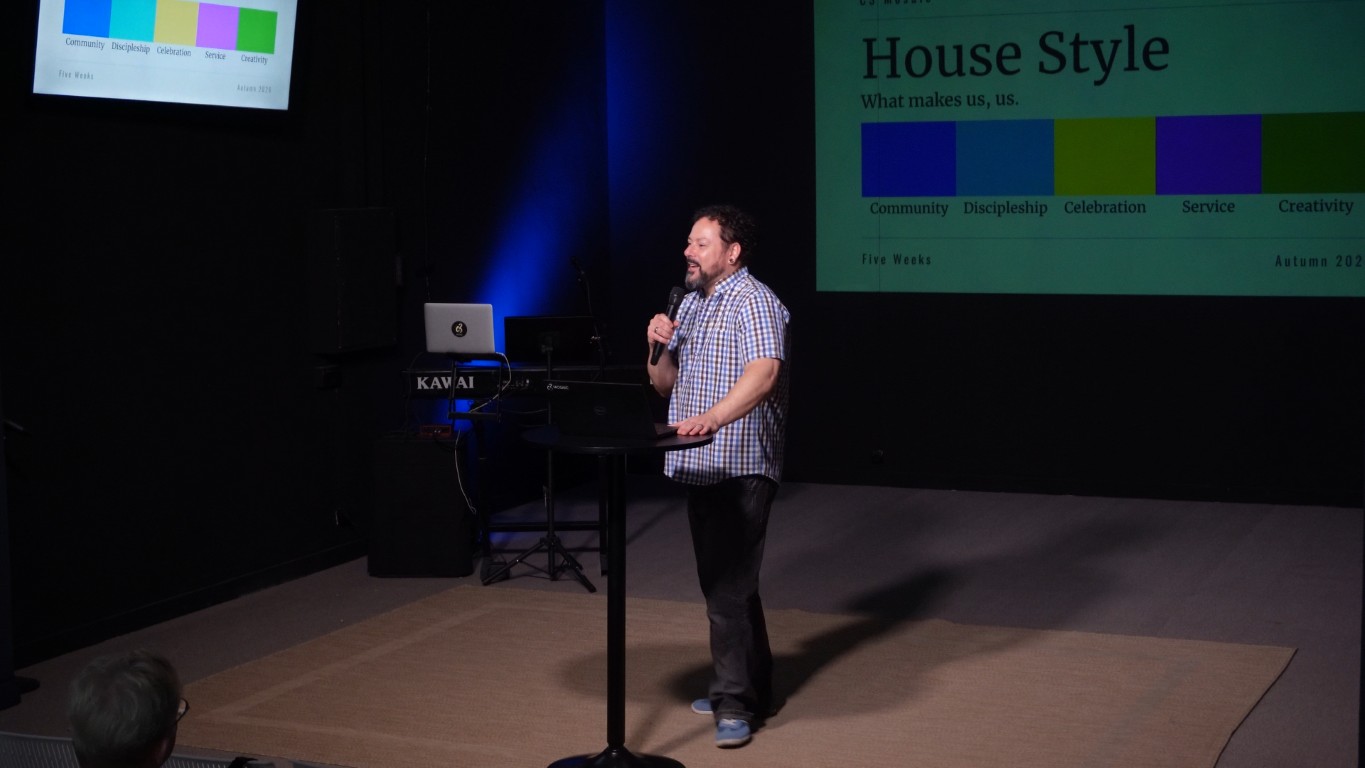
The kit exists in a light version and a dark one. A church projecting onto a black wall needs artwork built for low luminance; a church with a bright screen in a daylit room needs the opposite. The labels, rules and structure are identical in both — only the surface changes, which is the point of building it as a guide in the first place.
Specification as a design language
Putting hex codes on screen invites a kind of scrutiny most church graphics never get. If the design claims to be a specification, the specification has to be right. Every value on every slide was checked against the palette before the series shipped.
The insight worth naming
Consistency is the job. Not whether a graphic is good, but whether it looks like you — the social post, the slide, the website, the paint on the wall, the chair.